> ## Documentation Index
> Fetch the complete documentation index at: https://testdocs.ecomelixir.com/llms.txt
> Use this file to discover all available pages before exploring further.
# Set up your brand
> Configure colors, fonts, and buttons to match your brand identity
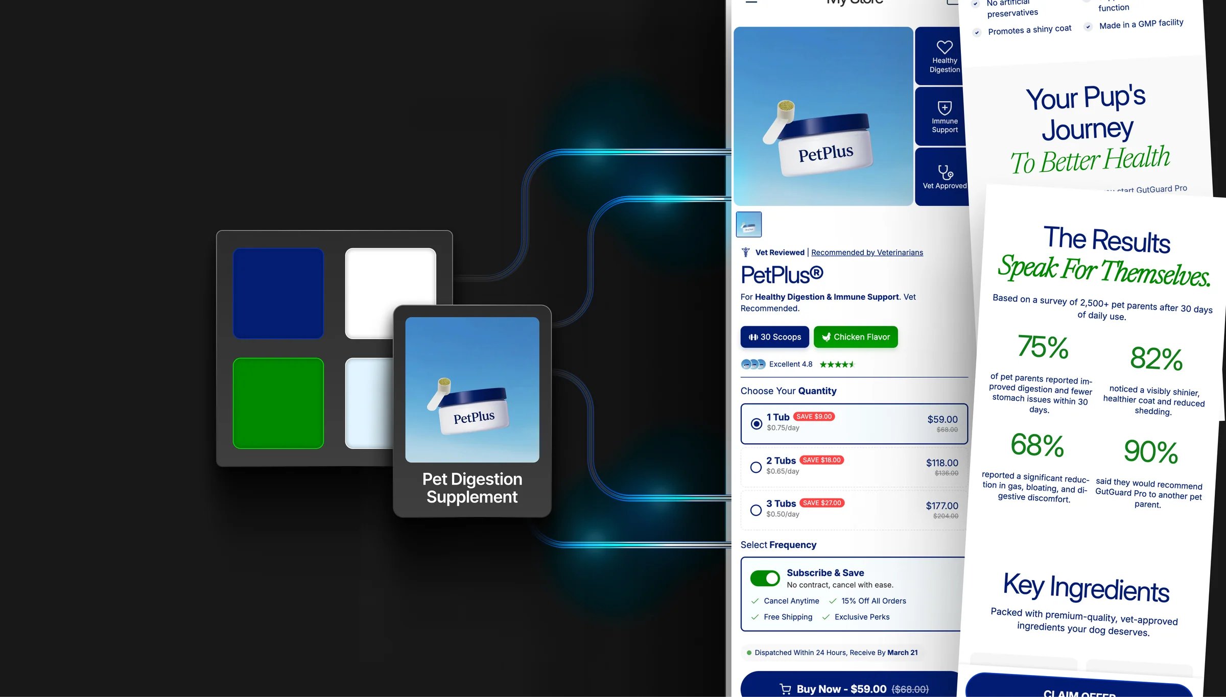 Everything in this guide is configured from **Theme settings** in the Shopify theme editor (the paintbrush icon in the left sidebar).
## Colors
Go to **Theme settings → Colors**.
### Core colors
| Setting | What it does |
| ---------------------- | ------------------------------------------------ |
| **Section background** | Default background color for all sections |
| **Section text color** | Default text color across the site |
| **Primary accent** | Links, highlights, badges, and emphasis |
| **Secondary accent** | Secondary highlights and call-to-action elements |
### Button colors
| Setting | What it does |
| --------------------- | ------------------------------ |
| **Button background** | Fill color for primary buttons |
| **Button text** | Label color on buttons |
### Navigation colors
| Setting | What it does |
| -------------------------- | ------------------------------- |
| **Header background** | Background of the site header |
| **Footer background** | Background of the footer |
| **Mobile menu background** | Background of the mobile drawer |
Most sections have a **"Use theme colors"** toggle. When enabled, the section inherits your global colors. Turn it off to give any section its own custom color scheme.
### Gradients
Many elements support gradient backgrounds — toggle **"Enable gradient"** on sections, buttons, or accent text to add depth to your design.
## Typography
Go to **Theme settings → Typography**.
Elixir supports **three independent font families**:
| Font | Used for |
| ---------------- | ----------------------------------------------------- |
| **Heading font** | H1–H6 headings |
| **Body font** | Paragraphs, descriptions, UI text |
| **Accent font** | Decorative or brand-specific text (e.g. script fonts) |
### Key settings
* **Heading scale** — make headings larger (up to 150%)
* **Body scale** — make body text larger (up to 130%)
* **Text transform** — set headings to uppercase, lowercase, or capitalize
* **Letter spacing** — tighten or loosen character spacing
* **Per-heading font choice** — use the heading font for H1/H2 but body font for H3–H6 (or any combination)
* **Custom font sizes** — enable to manually set exact pixel sizes for each heading level
Enable **RTL support** in typography settings if your store serves Arabic, Hebrew, or other right-to-left languages.
## Buttons
Go to **Theme settings → Buttons**.
Elixir has a **global button system** — style your buttons once and it applies everywhere. Sections can override the global style if needed.
### Style options
* **Corner radius** — 0px (square) to 40px (pill-shaped)
* **Font size, weight, and letter spacing**
* **Vertical padding** — control button height
* **Text transform** — uppercase, capitalize, etc.
### Colors and effects
* **Background, text, and border colors** with separate **hover colors**
* **3D effect** — add a bottom border to create a raised/3D look
* **Box shadow** — add depth with adjustable intensity
* **Gradient buttons** — set gradient start/end colors, direction, and a shine effect
## Layout
Go to **Theme settings → Layout**.
| Setting | What it does |
| ---------------------------- | ------------------------------------------------------------------ |
| **Page width** | Maximum content width (1000–1600px) |
| **Section padding** | Vertical and horizontal padding inside sections (desktop & mobile) |
| **Spacing between sections** | Gap between consecutive sections |
### Animations
| Setting | What it does |
| ---------------------------- | ---------------------------------- |
| **Reveal on scroll** | Sections animate in as you scroll |
| **Hover elements animation** | Cards and buttons animate on hover |
Everything in this guide is configured from **Theme settings** in the Shopify theme editor (the paintbrush icon in the left sidebar).
## Colors
Go to **Theme settings → Colors**.
### Core colors
| Setting | What it does |
| ---------------------- | ------------------------------------------------ |
| **Section background** | Default background color for all sections |
| **Section text color** | Default text color across the site |
| **Primary accent** | Links, highlights, badges, and emphasis |
| **Secondary accent** | Secondary highlights and call-to-action elements |
### Button colors
| Setting | What it does |
| --------------------- | ------------------------------ |
| **Button background** | Fill color for primary buttons |
| **Button text** | Label color on buttons |
### Navigation colors
| Setting | What it does |
| -------------------------- | ------------------------------- |
| **Header background** | Background of the site header |
| **Footer background** | Background of the footer |
| **Mobile menu background** | Background of the mobile drawer |
Most sections have a **"Use theme colors"** toggle. When enabled, the section inherits your global colors. Turn it off to give any section its own custom color scheme.
### Gradients
Many elements support gradient backgrounds — toggle **"Enable gradient"** on sections, buttons, or accent text to add depth to your design.
## Typography
Go to **Theme settings → Typography**.
Elixir supports **three independent font families**:
| Font | Used for |
| ---------------- | ----------------------------------------------------- |
| **Heading font** | H1–H6 headings |
| **Body font** | Paragraphs, descriptions, UI text |
| **Accent font** | Decorative or brand-specific text (e.g. script fonts) |
### Key settings
* **Heading scale** — make headings larger (up to 150%)
* **Body scale** — make body text larger (up to 130%)
* **Text transform** — set headings to uppercase, lowercase, or capitalize
* **Letter spacing** — tighten or loosen character spacing
* **Per-heading font choice** — use the heading font for H1/H2 but body font for H3–H6 (or any combination)
* **Custom font sizes** — enable to manually set exact pixel sizes for each heading level
Enable **RTL support** in typography settings if your store serves Arabic, Hebrew, or other right-to-left languages.
## Buttons
Go to **Theme settings → Buttons**.
Elixir has a **global button system** — style your buttons once and it applies everywhere. Sections can override the global style if needed.
### Style options
* **Corner radius** — 0px (square) to 40px (pill-shaped)
* **Font size, weight, and letter spacing**
* **Vertical padding** — control button height
* **Text transform** — uppercase, capitalize, etc.
### Colors and effects
* **Background, text, and border colors** with separate **hover colors**
* **3D effect** — add a bottom border to create a raised/3D look
* **Box shadow** — add depth with adjustable intensity
* **Gradient buttons** — set gradient start/end colors, direction, and a shine effect
## Layout
Go to **Theme settings → Layout**.
| Setting | What it does |
| ---------------------------- | ------------------------------------------------------------------ |
| **Page width** | Maximum content width (1000–1600px) |
| **Section padding** | Vertical and horizontal padding inside sections (desktop & mobile) |
| **Spacing between sections** | Gap between consecutive sections |
### Animations
| Setting | What it does |
| ---------------------------- | ---------------------------------- |
| **Reveal on scroll** | Sections animate in as you scroll |
| **Hover elements animation** | Cards and buttons animate on hover |